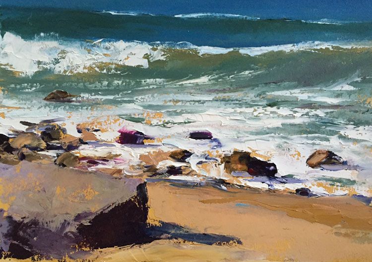


Painting familiar subjects allows Bowditch to experiment with color, tone, and texture. One experiment involves what Bowditch calls “hiding color.” For example, in “Seasoned Observer,” waves roll in from a deep blue sea, turning green and foamy white as they swirl among rocks on the shoreline. Enlivening this familiar scene, Bowditch has added subtle tones of pink among the rocks and in the tidal pool. A deep purple slab of a boulder in the left foreground has flashes of ochre across its surface, picking up on the colors of the sand. These flecks of yellow carry our eye to the yellows in the curls and crest of the incoming wave.
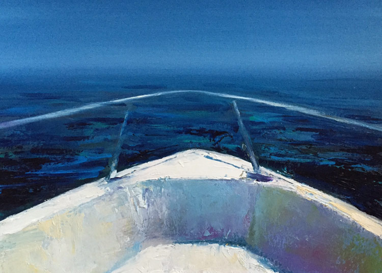
Similarly, the seemingly simple composition of blue and white of “Into the Mystic” becomes a complex layering of color to create the rich sapphire blue of the water. In the foreground, the bright white bow of a boat cutting through the water has shades of yellow and pink adding shadows and complexity to its curving contours.
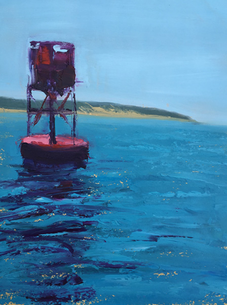
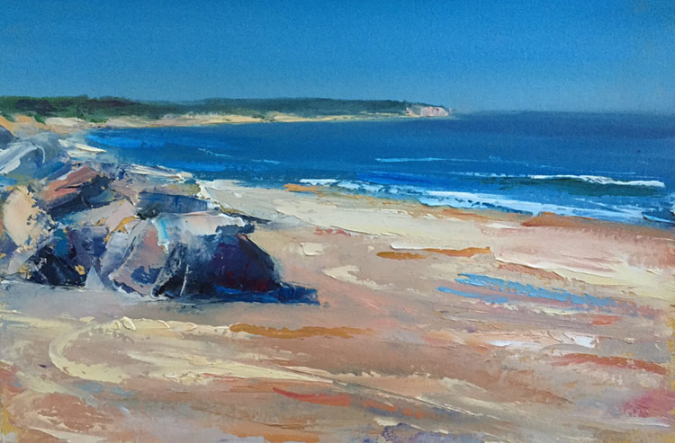
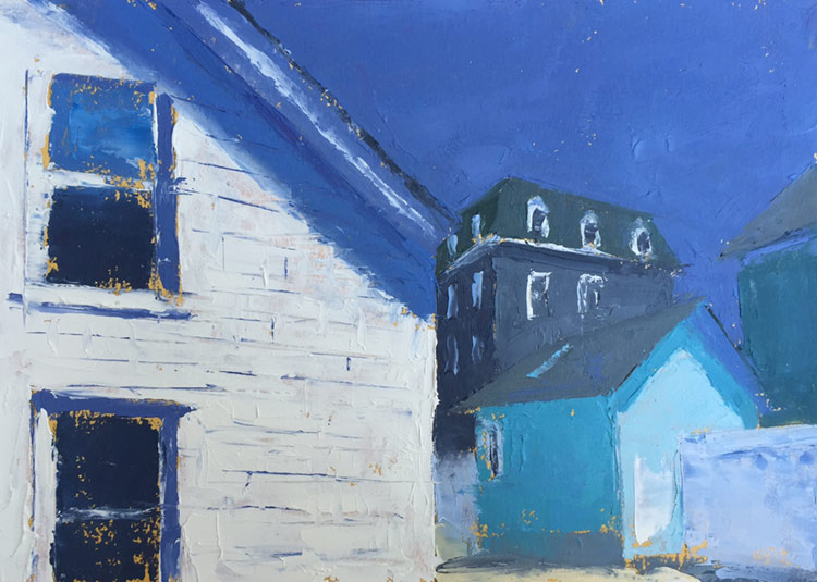
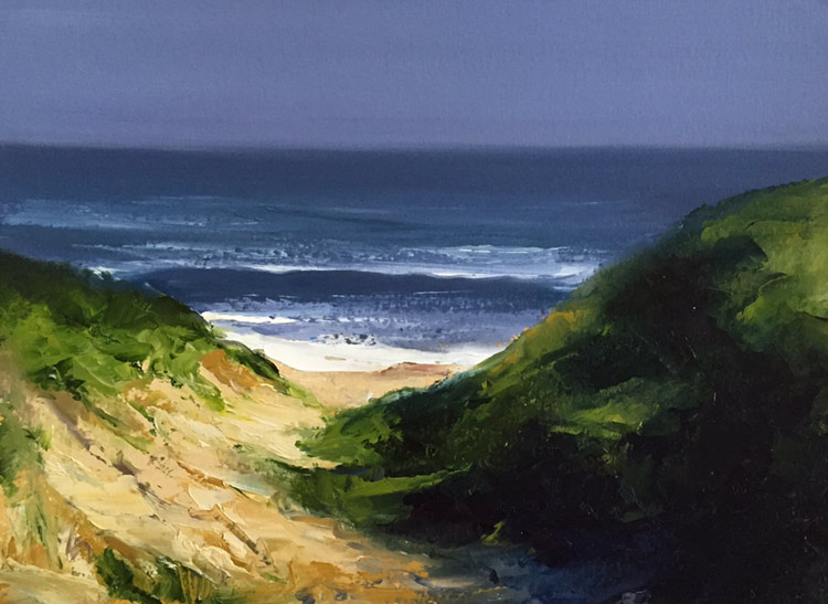
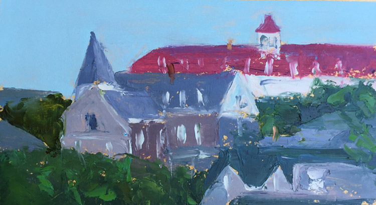
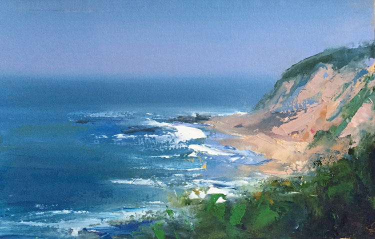
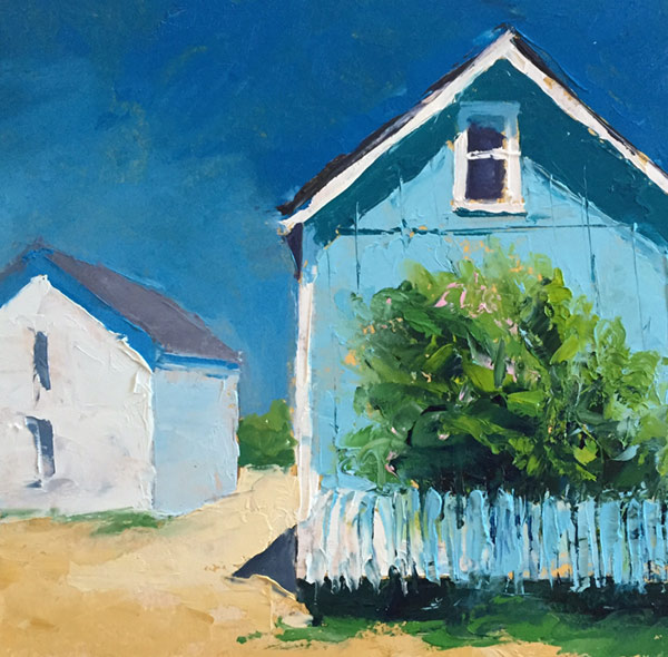
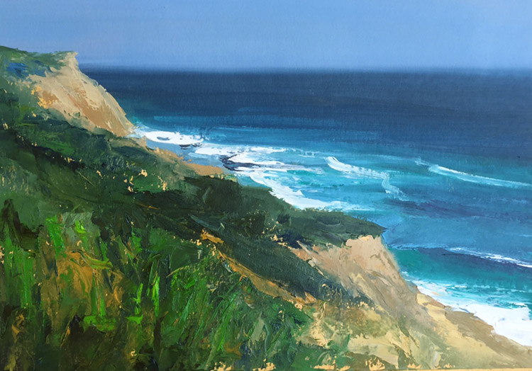
In addition to embedding color, Bowditch has added new colors to her palette, notably red and turquoise. “R2Bell” is the most vivid use of red in this study of the red bell buoy bobbing in clear blue water, with the tan swath of Clay Head in the left background. Bowditch uses turquoise in combination with more naturalistic shades of blue and green in “The Guardians” to make the surf more vivid against the deep blue water and the warm tans and greens of the bluffs. In “Surfside,” the simple lines of a building are enlivened by its turquoise siding and picket fence. while “Weathered Assembly” is a richly textured study of roof lines and angles melding different blues to accentuate structural details.
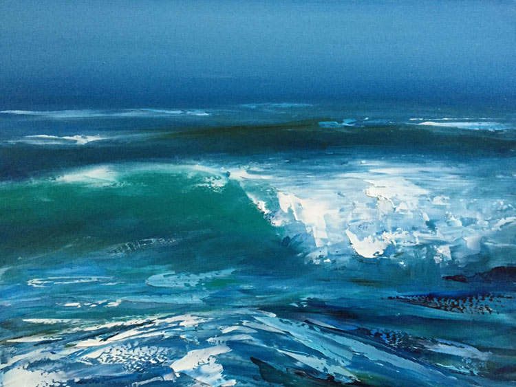
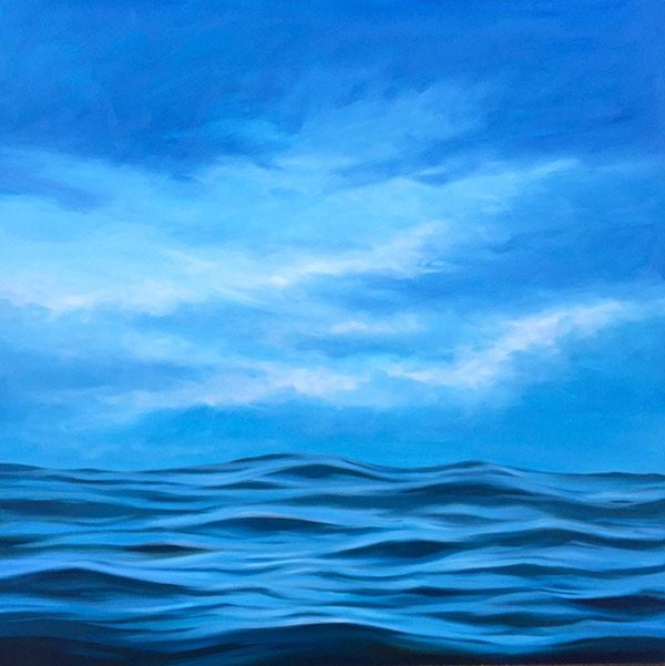
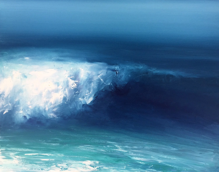
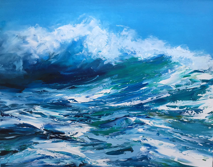
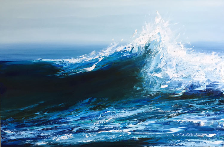
Playing around with texture and technique, Bowditch has created five “waterscapes,” a series of wave studies done in oil on gesso board using a palette knife. With the exception of “Placidity,” an undulating wave-eye-level study in soothing blues, the other works (“Crest,” “Surge,” Swell,” and “Upheaval”) depict the protean force and beauty of the sea. As Bowditch explained, “ The surface of the board gave me the freedom to push the paint around, building texture.”
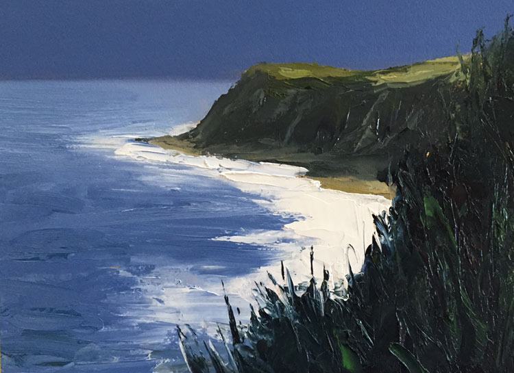
In several works, Bowditch experimented with using very limited color to different effect. For example, “Rodman’s Amble” evokes the oppressive heat of a hot, humid summer afternoon through the use of soft complementary colors of low contrast, while “Silver Lining” is a dramatic work of high tonal contrast in which the brilliant white surf across the center right links the deep blue moon-lit water and the dark, deeply shadowed greens of the bluffs.